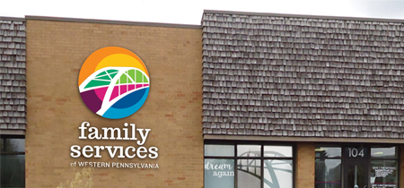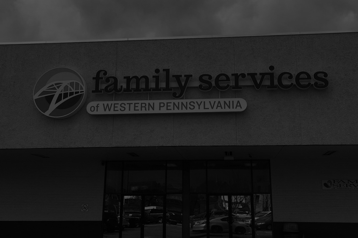
Family Services is a large, historic organization that serves many diverse people. The common thread? A commitment to helping people find their path toward a brighter future. We used the symbolism of a bridge to communicate this vision (which is also a nod to the three-rivers region), and prismatic colors to represent their vast diversity of programs. Throughout the discovery process, we also worked with the communications team to incorporate their new tagline, “Dream Again,” into their brand. The result is a fresh new identity that achieved that most difficult of tasks: broad support among a wide range of stakeholders.